
From concept to adventure
After planning, organising and experiencing a once in a lifetime trip around Asia, I knew there had to be an easier way for me to keep track, plan and explore the rest of the world. This is where Tripi was born...

83.3% - Easily follow my entire trip from start to finish

Easily plan trips
Research revealed that 'ease of use' ranked highest when users were asked what the most important feature of a travel app would be. With this in mind, a user-centric approach was taken when designing Tripi.
Tripi was designed to aid the user in their travels, whether it be a 6000 mile trip around Asia or a trip to the seaside. Tripi will allow users to keep their travel ideas and plans in one place, allowing them to explore, whilst also keeping track as they venture out on their perfect trip.

All in one place
Airbnb received 83.3% of the results for ‘what is your favourite travel app?’
All responses to the survey showed when planning a trip it would be easier to have everything all in one place. Based on this I decided to try and develop a simple initial page which would guide the user during their travels.
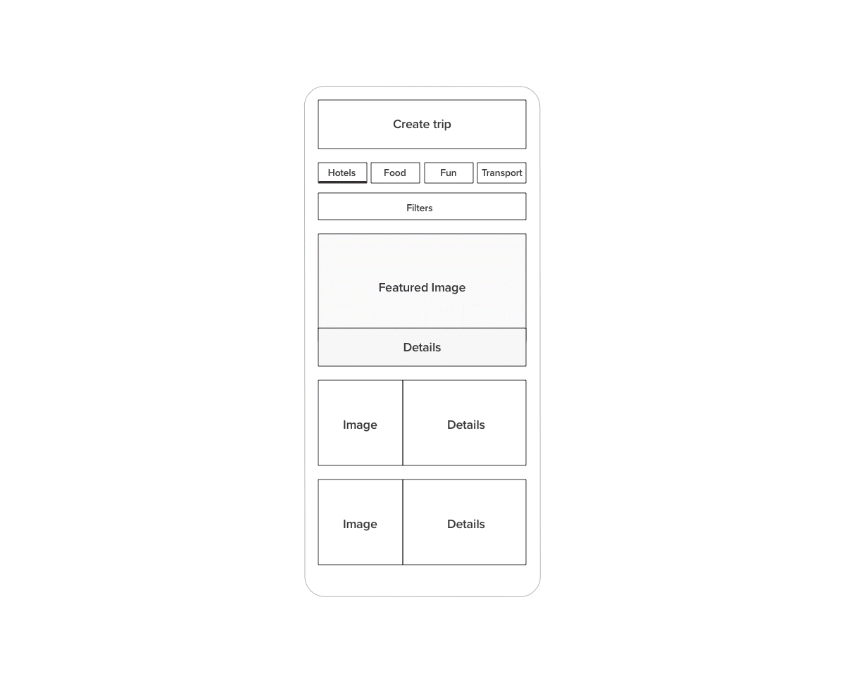
Having hotels, transport, food and points of interest to see all in one place would allow the user to tab across between all the key elements involved in most trips.
Personally when I travelled for 3 weeks one of the main annoyances was having all bits of information spread across digital and physical forms (paper).

Stay on track
80% - Easily follow my entire trip from start to finish
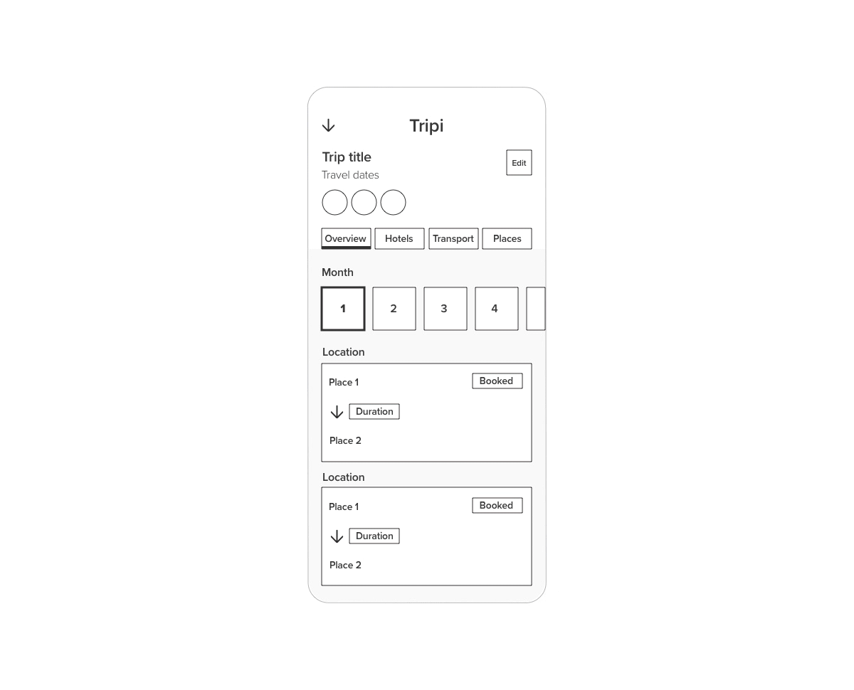
Tied with ease of use, the trip overview page needed to be simple yet still show all the key information at a glance. Based on this I decided to have a full overview of the entire trip by date but also on a granular level split it up into any hotels, transport and places that the user added for the trip.
Features


Better together
The survey response to having a social element within the app ranged from important to very important. If users had friends with the app then they could simply join them and then have the same overview of the entire trip with clear visibility of who else is part of the group.
Logo development
The focus was always going to be on being at a location and the key element of travel. The name came from playing with the idea of a trip and being happy on your travels.
The final version of the logo encompasses the idea of travel and location by using a pin and the semi-circle represents the world.


UX development
Since the start of the idea and from early development I knew it was key to create the app with the user in mind. With continual iterative feedback, I was able to update the designs and keep everything streamlined. Every decision was an informed choice and the prototype was used to study how the users interacted with the app and report on any pain points. With 100% of the survey saying 'ease of use' is the most important thing, all design choices had to make planning the perfect trip the best experience possible.
Home screen development
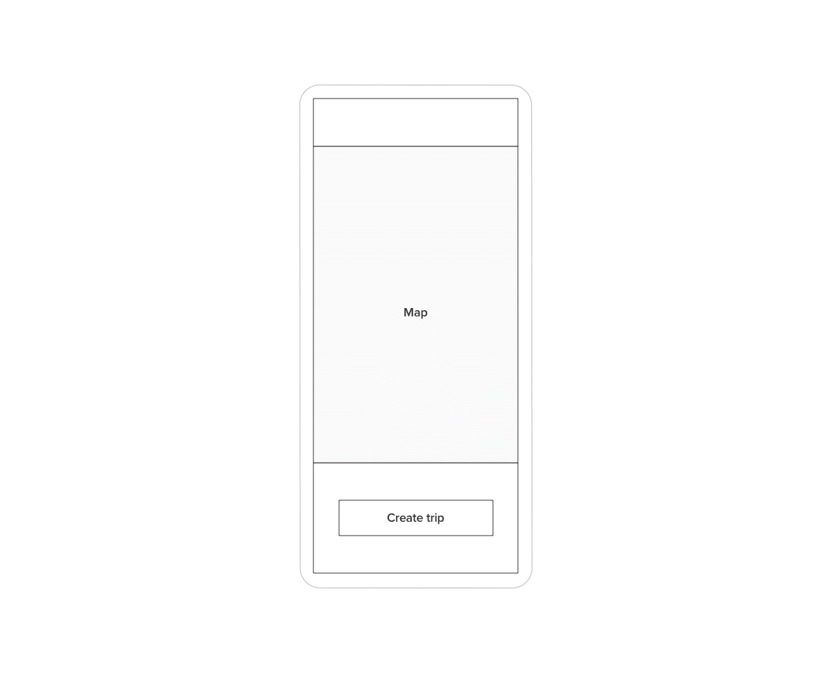
The primary function of the app is to help easily plan trips, with that in mind I knew the homepage needed to contain a map so the user could easily track their trip and discover new areas or things to do along the way.
As the screen developed from basic wireframes, small improvements were made to the design such as icons to represent categories. Since creating a prototype I could see it in a working scenario and the main issue I noticed was the height of the header. It was restricting the map view and based on further external feedback, comments were made about it feeling ‘squashed’. Based on this feedback the search bar was taken outside of the header to allow more of the map to show. Further tests still need to be conducted to see if the contrast between the search bar and header works.
Key changes/feedback
Decrease user icon size
Icons for categories
Decrease search bar height
Position search bar below header for less restrictive view
Trip overview development
The trip overview page needed to provide a clear way to show the user what was happening each day on their trip. From the early wireframes and based on some of the survey answers (83.3 ‘Follow trip from start to finish’) it was clear that there needed to be a full overview. Based on this I decided to break the flow into an overview but also a granular level so the user could specifically look at one area for that day e.g. hotels. This allowed the user to have multiple ways of accessing the same information based on their personal preference.
During the early designs simple elements were added such as icons to represent the mode of transport and clearly highlighting the duration. The most recent feedback noted the lack of an edit button, which was initially removed. As this screen represents the trip the latest version will replace the users’ icon with the ability to edit the trip name/admin settings.
Key changes/feedback
Icons to represent modes of travel
Highlighting the current date
Add group members
Discovery development
The discovery page acts as a central hub for all the key things Tripi. This page is accessed directly from the homepage with the biggest changes being around clarity of information.
Early comments and feedback suggested overuse of colours and image size issues. From this I updated the page to only use the purple as more of an accent and the changing the primary CTA to stand out better as the primary initial function of the app is to create a trip. Initially the page was going to act as a hover/slide up above the home page but after discussion with the developer it was decided it would better suit being a separate page which simplified an arguably complicated design.
Key changes/feedback
Grey background for contrast
Improved filters and categories
Improved colour usage
Better highlighting the primary CTA

