
Case Study - Encore Musicians
Helping customers find the right musician, sooner
Industry
Live Music
Tools used
Figma, Clickup, Maze

Product focus
Improving first-session matches
Help more customers discover a suitable musician and take the first step towards booking during their initial visit.
Finding conversion opportunities
Used customer interviews to uncover friction across the booking journey and identify opportunities for experimentation.
Testing ideas through data
Designed and evaluated product experiments to understand what improved engagement, reduced friction and encouraged customers to take action.
My design approach

Identify opportunities
Understand where customers lose confidence or drop out.

Running experiments
Identify opportunities and test potential improvements.

Success metrics
Evaluate the impact on discovery, enquiries and bookings.

Understanding what drives a booking
Customer interviews
To understand the customer journey end-to-end, we spoke with users at key points in the sales funnel, including:
Customers who had just booked a musician
Customers who had completed their event
Customers who dropped off before booking
These conversations gave us insight into motivations, friction points, and opportunities to improve the experience across every stage.
What customers needed to feel confident booking

Customers wanted more than a profile; they wanted to experience a musician’s sound and style to picture how they’d fit their event.
Media

Reviews helped build trust and ease concerns about performance quality, especially for once-in-a-lifetime events where customers wanted to feel confident in their choice.
Reviews

Customers often preferred local musicians to keep costs and travel concerns down, making bookings feel more reliable and manageable.
Location

Running experiments
Improving musician discovery
Helping customers find and choose the right musicians
Making musician profiles more engaging
The problem
Customers needed a better feel for a musician’s sound and personality before deciding whether they were right for their event.
The hypothesis
Showing musicians in action would help customers understand their style and spend more time exploring suitable profiles.
The change
I explored autoplaying musician videos to bring profiles to life and make it easier for customers to experience a musician’s performance.
The result
The experiment didn’t clearly increase conversion. However, the video experience offered a more engaging way to discover musicians, so we kept it as a smaller UX improvement rather than treating it as a proven growth lever.

Exploring a matchmaking-style experience
The problem
Finding the right musician could involve browsing multiple profiles without a clear sense of which options best suited a customer’s needs.
The hypothesis
A more guided, matchmaking-style experience could help customers discover suitable musicians more easily and make the process feel more intuitive.
The change
I explored a Tinder-style interaction that allowed customers to move through musician options in a more focused, interactive way.
The result
Users engaged with the concept, but the A/B test didn’t demonstrate a strong enough impact to justify moving forward with it. This reinforced the importance of validating new interaction patterns against meaningful outcomes, rather than engagement alone.

Simplifying the enquiry process
The problem
The existing enquiry journey asked customers to complete several steps before they could move closer to booking a musician, creating potential friction early in the process.
The hypothesis
Reducing the number of steps would encourage more customers to start an enquiry without compromising the quality of the match.
The change
I simplified the enquiry form to make getting started feel quicker and more straightforward.
The result
3× Increase in customers starting the enquiry form
The next step was to investigate drop-off within the form and validate whether the improvement also translated into completed enquiries and stronger first-session matches.


Using the customer’s language
The problem
The wording of calls to action can influence whether customers understand what will happen next and feel confident enough to engage with a musician.
The hypothesis
Using clearer, more familiar language would make the next step feel more approachable and encourage customers to explore profiles.
The change
I tested changing the musician-card CTA from “Check availability” to “Message”, alongside a change to the primary CTA colour from its original treatment to blue.
The result
Both changes increased click-throughs on musician tiles. These smaller experiments highlighted how seemingly minor copy and visual decisions can influence customer behaviour.
Making musician cards easier to compare
The problem
Musician cards needed to communicate a lot of useful information, but too much detail could make it harder for customers to compare options and identify the most relevant musicians.
The hypothesis
A clearer visual hierarchy, with key booking information easier to find, would help customers assess musicians more quickly and take the next step with confidence.
The change
I refined the cards to prioritise musician imagery, names and reviews, while improving how pricing and additional information were presented. This included:
Making the price more prominent.
Showing an initial deposit breakdown when needed.
Grouping less essential details behind a “+X more” interaction.
Clarifying set pricing and costs.
Adding a “Ready to book” badge when a musician matched the selected date and location.
Introducing video previews on hover.
The result
The revised designs prioritised the information customers needed to compare musicians, bringing pricing, reviews and availability into clearer focus. The aim was to make discovery easier without overwhelming customers with detail.
Creating a more useful media player
The problem
The existing media player offered limited context around a musician’s content. Customers could watch a video, but had fewer clear ways to explore further or move towards an enquiry.
The hypothesis
Combining richer media with relevant information and clear next steps would help customers assess musicians and continue their journey.
The change
I redesigned the player experience to include:
More descriptive text around the musician’s content.
Links to relevant reviews.
An “Up Next” queue to encourage further exploration.
A clear “Check Availability” CTA.
Save and chat actions to support the next step.
The result
The redesigned player brought musician content, reviews and next steps into one experience. This created a clearer proposed route from watching a performance to exploring a musician or making an enquiry.
Supporting the marketplace
Admin tools, availability and musician pricing
Admin
Helping admins make better recommendations
The problem
The admin team often had to go back and forth to check musician availability and decide who to recommend to customers. Important information wasn’t always easy to compare at a glance.
The hypothesis
Bringing availability, responsiveness and relevant admin context into one view would help the team make faster, better-informed recommendations.
The change
I explored an improved admin interface featuring:
Availability against the customer’s event date.
Travel-radius information.
Colour indicators to make key details easier to scan.
Space for internal admin notes.
Musician response-rate percentages.
The ability to prioritise musicians by response rate.
The result
Positive feedback from admins using the new interface, who said it made their jobs easier.
By bringing key information together in one place, the interface made musician availability and suitability easier to assess, reducing manual checking and back-and-forth.
Admin
Bridging the availability gap
The problem
Customers couldn’t always tell whether a musician was available for their event. Musicians also needed a simpler way to communicate availability without repeatedly responding to enquiries that might not be suitable.
The hypothesis
Giving musicians a straightforward way to manage their calendars would make availability clearer, reduce unnecessary back-and-forth and help customers move towards booking sooner.
The change
I worked on an availability-calendar concept, using clickable prototypes and feedback from volunteer beta testers to explore how musicians would manage dates and communicate availability. I also interviewed musicians about pricing, overlapping dates and their existing workflows.
The result
Beta testers described the calendar as easy to use and familiar, with some expressing interest in Google Calendar integration. Their feedback also highlighted privacy as an important consideration when sharing availability.
Giving musicians more control over pricing
Musician side
The problem
Keeping prices up to date could be time-consuming for musicians, while a single guide price didn’t always reflect differences between dates or event requirements.
The hypothesis
Allowing musicians to adjust prices for specific dates and event details would give them more flexibility, reduce manual work and help customers receive more accurate quotes.
The change
I explored date-based pricing and more granular pricing options through musician interviews, prototypes and testing. This included letting musicians set different prices for particular dates and tailor pricing to event requirements.
The result
Testers responded positively to the additional flexibility. Research also highlighted areas that needed further consideration, including how guide prices should be presented, how pricing changes over time and how to prevent misuse. Musicians also emphasised that factors beyond date and event type can affect their final quote.
Making instant quotes more compelling
Customer side
The problem
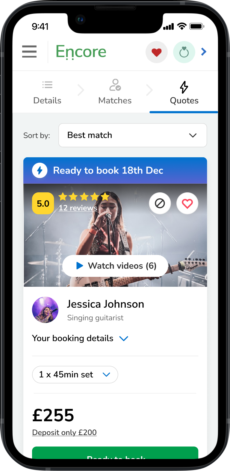
Standard quotes could involve delays while customers waited for a musician to respond. Instant quotes offered a faster alternative, but customers needed to understand the benefit and feel confident choosing one.
The hypothesis
Making instant quotes more visible and communicating their speed and convenience more clearly would encourage customers to engage with them.
The change
I explored how instant quotes were presented in the customer journey, including the “Ready to book” messaging and a lightning-bolt icon to communicate speed and convenience. I also tested the terminology with customers to understand how clearly it conveyed the benefit.
The result
The data showed a clear increase in conversion for instant quotes compared with standard quotes. The next step was to expand the beta group and validate the results with more customers and musicians.

Making regional pricing more transparent
Customer side
The problem
Customers needed a clearer understanding of the full cost of booking a musician, including travel. Meanwhile, musicians wanted more control over the areas they covered and the additional costs associated with travelling further.
The hypothesis
Allowing musicians to define regional pricing would make costs clearer for customers, set more accurate expectations and help match customers with suitable musicians.
The change
Customer and musician interviews informed an approach to regional pricing. The concept explored allowing musicians to choose the regions they served and set relevant costs, while helping customers understand pricing based on location.
The result
Research highlighted a gap between customer expectations and how musicians priced travel. Customers wanted greater cost transparency and sometimes assumed musicians couldn’t travel beyond their local area. Musicians, meanwhile, wanted flexibility to limit their coverage or account for longer journeys. These findings helped shape the proposed regional-pricing experience.