Involve Education
Website & Platform: Aligning Brand, Conversion, and Product Usability
Industry
Education
Tools used
Figma

Design focus
Get more demo bookings
Insights from user research and marketing data highlighted that product demos were a key driver of conversion. However, the website's tone and lack of emphasis on demo booking created a missed opportunity. I redesigned key touchpoints to strengthen messaging and guide users toward scheduling a demo.
Improve product usability
The existing product suffered from visual inconsistencies and an outdated design system, negatively impacting usability and the overall user experience. A visual refresh was needed to modernise the interface and create a more cohesive and intuitive experience.

Conducted a competitive analysis of existing education platforms, focusing on identifying our unique value propositions, refining our tone of voice, and drawing inspiration from best-in-class demo experiences.
Research

Centred the redesign around the primary metric of increasing demo bookings, creating an end-to-end site experience focused on conversion. Simultaneously, worked to elevate the product’s overall presentation.
North Star Focus

Built working prototypes for the website and product, sharing them with internal teams and clients to validate design decisions and drive user-informed refinements.
Prototyping
Refining the Message, Elevating the Look
Collaborated closely with a marketing freelancer to shape the website narrative and clarify the value proposition, with a focus on improving conversion rate optimisation.
Before:
Call to action is unclear.
The heading is cold, clinical and doesn’t solve the problem.
‘Getting started’ talks about booking a demo before explaining the problem and how Involve can help
Lack of product visuals
Hidden case studies
Elevated Hero
Focused header with the USPs of simplicity and centralisation of tools.
Social proof of the founder being a teacher to strengthen the trust and understanding of the problem.
Clear CTA’s.
Blurred out the product image to tease what the customer could see in the demo.
Highlighted UI elements for some of the highly requested features of scheduling and data analysis.
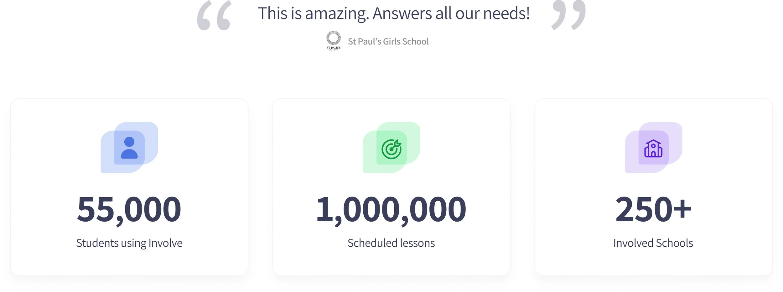
Social proof right above the fold and data-led incentives.
New design
Key Problems
After gathering data from past customers, we were able to narrow the focus to 3 main areas where Involve was solving the biggest problems.
Centralisation: reduction of platforms.
Time saving through AI scheduler.
Smarter insights, which helped teachers with reporting.
For each of the problems, I created a simple mix of UI elements and a tone of voice directed at the teachers and their frustrations.
New design
New design
Big Savings
Small section on cost to cover more price-sensitive customers.
Highlighting the solution being fully integrated.
Copy speaks to the customer’s problems and needs.
New Design
Feature Focus
Split out the features into 4 sections to appeal to all customer types
Department-specific features were added to appeal to customers viewing the website but only interested in a specific department, e.g. director of music.


New design
Social Proof
Customer research showed that integrations, reviews, and case studies were key trust drivers—essential for building confidence in both the product and the company.