
Case Study - Muzz
Rethinking the ghosting experience
Industry
Dating App
Tools used
Figma, Mixpanel, Lottie

Product focus
Rethinking the ghosting experience
Redesigned a restrictive post-match experience to encourage better conversations without limiting the rest of the app.
Designing for better behaviours
Used behavioural insights and user feedback to understand why people were dropping off and shape a more considered solution.
Turning insight into action
Combined Mixpanel recordings, concept testing and cross-functional collaboration to identify friction, validate ideas and refine the final experience.
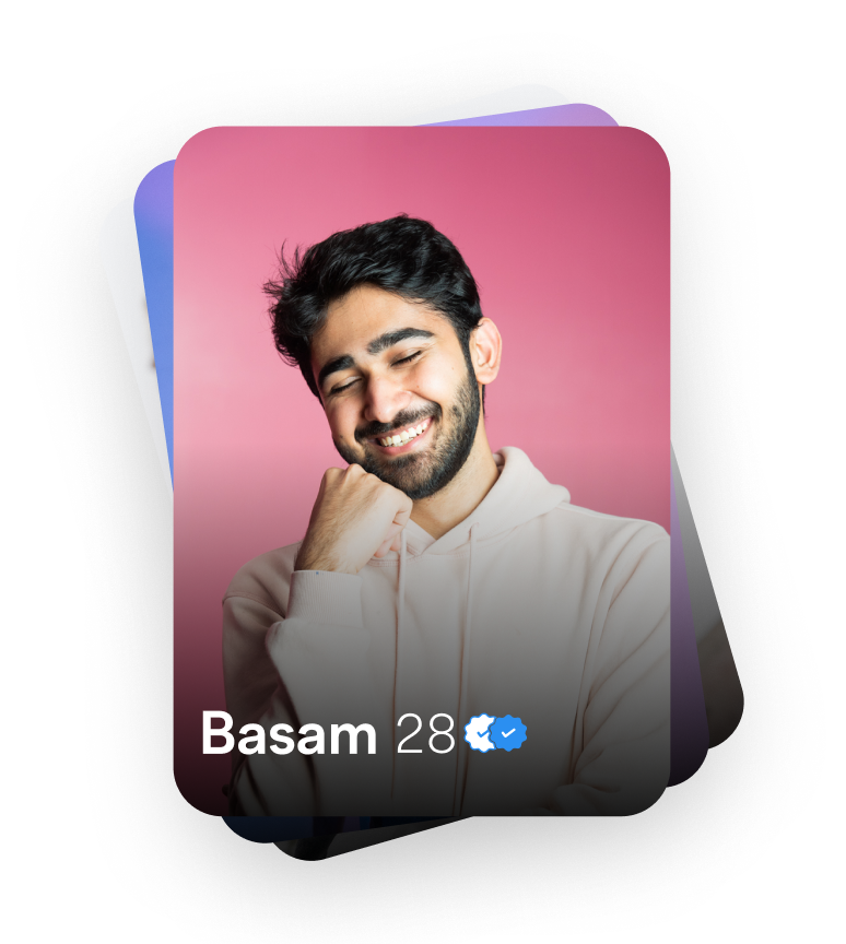
Encouraging better conversations
Ghosting was an ongoing problem in the dating experience. We wanted to encourage users to respond to their matches or make a decision about conversations that had gone quiet.
The original feature restricted access to the app until users addressed their inactive conversations. But was this encouraging better behaviour, or getting in the way?
The challenge was to encourage meaningful interactions without making the wider app feel restrictive.
The challenge
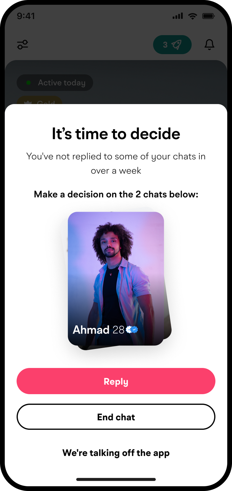
Understanding the friction
The user behaviour told a different story
I reviewed Mixpanel recordings to understand how users were interacting with the existing experience.
Users were trying to dismiss the half-sheet by tapping outside it. Some were even force-quitting the app, seemingly because they thought something was broken or couldn't find a way forward.
What I discovered
Too restrictive
The full app lockout interrupted activities beyond the inactive conversations themselves.
Unclear interactions
Users expected familiar behaviours, such as dismissing a sheet, but couldn't do so.
Missing interactions
Users were trying to tap the profile of their match but wouldn’t take them to the chat page or give context of their last message.
The insight: The feature was designed to encourage action, but the way it worked was creating additional friction.
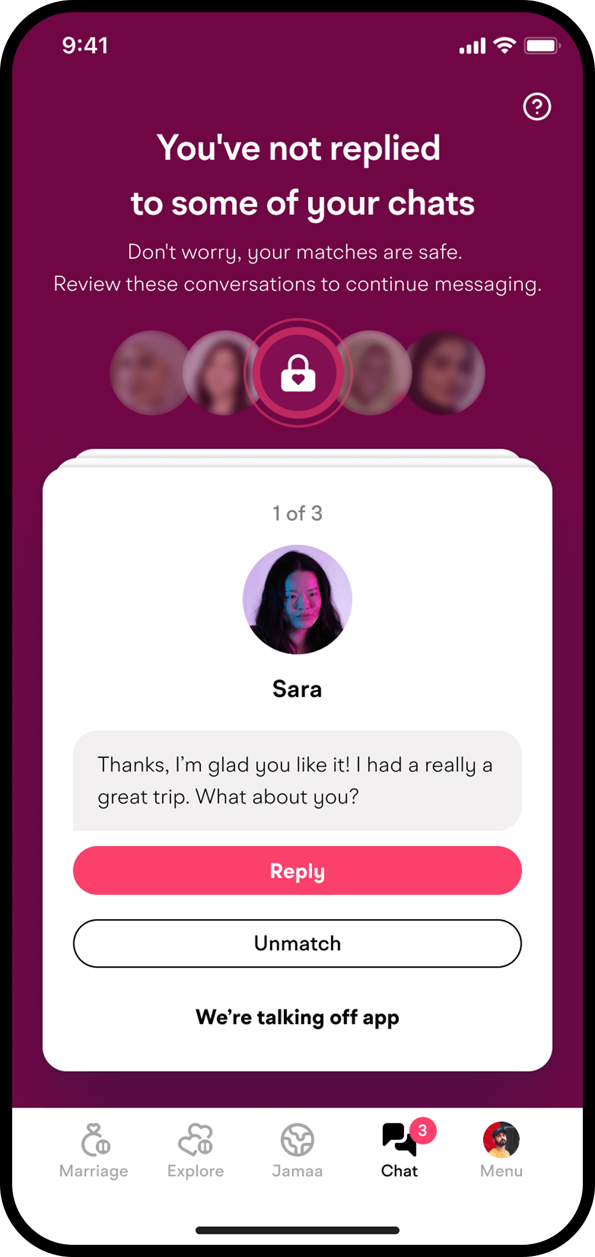
From restricting access to guiding action
Rethinking the approach
Rather than making the restriction more forceful, I explored how we could keep inactive conversations visible and actionable without locking users out of the wider app.
The redesign focused on three principles:
1. Give users control
Let users continue browsing the rest of the app instead of forcing them through a single flow.
2. Make the next step clear
Provide straightforward options to reply, unmatch or indicate that the conversation had moved off-app.
3. Explain when needed
Use clear states and optional context to help users understand the feature without overwhelming them.
Exploring concepts
Finding the right balance
I explored three concepts to understand how the experience could work in practice. I shared them with the wider product team and SLT to gather early feedback and challenge my assumptions.
Concept 1
Enhanced decision stack
Maintain the existing modal approach but improve:
Context visibility
Profile access
Action clarity
Concept 2
Simplified sheet
Introduced first-time onboarding to explain ghosting, alongside iterations to button hierarchy and copy to make the next steps clearer.
Concept 3
Inbox cleanup flow
Inspired by familiar inbox-cleanup patterns:
A full-screen queue for inactive conversations
Access to the wider app without a forced half-sheet
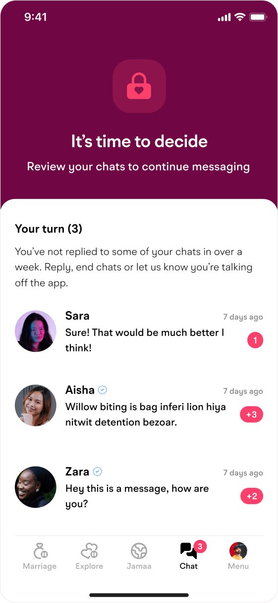
Turning early feedback into a clearer design approach
Finding the right direction
I presented the three concepts alongside the thinking behind each approach. The inbox cleanup concept stood out to stakeholders as a more focused and actionable solution, particularly because users could continue using the rest of the app rather than being locked into a single flow.
This opened up a new perspective on the experience, highlighting an option that hadn't previously been considered. To explore it further, I refined the concept into three interactive prototypes, including an alternative accessed directly from the match drawer, to gather feedback from the wider team and validate the chosen direction.
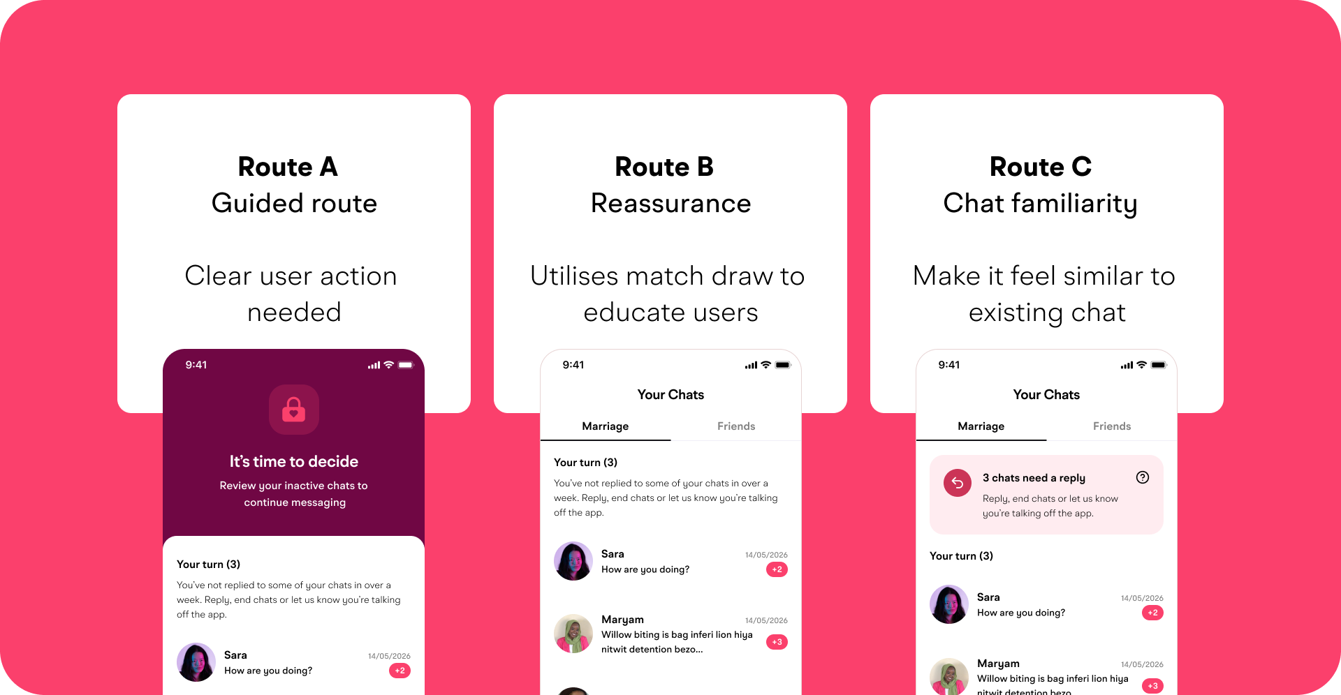
Validating the chosen direction
I developed three interactive prototypes to explore different ways of encouraging users to address inactive conversations. I tested them with a cross-functional group of eight participants, gathering feedback on the clarity, urgency and overall feel of each approach before presenting the findings to stakeholders.
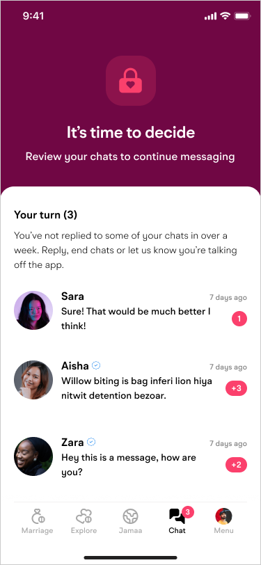
Route A
Repeated feedback:
“Breaks autopilot”
“Very clear”
“Visually obvious”
“Forces action”
Potential concerns:
Too modal/abrupt
Less aligned with the integrated chat experience direction
Key takeaway:
Route A is doing a good job at attention capture
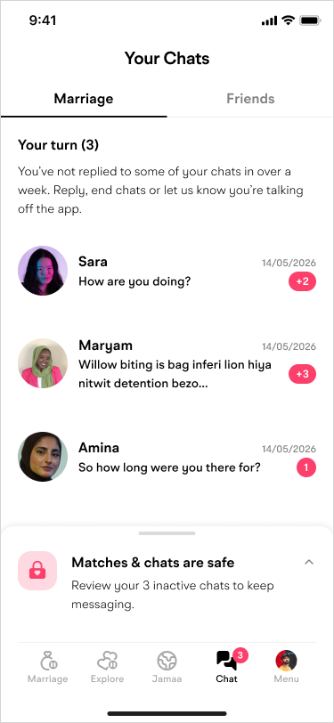
Route B
Repeated feedback:
“Balanced”
“Least jarring”
“Clear without being too aggressive”
“Gives users a clear choice”
Potential concerns:
Lack of urgency
Too close to chat context without enough visual interruptions
Key Takeaway:
Reassurance that chats/matches still exist
Preserves chat context action feels intentional, not hidden
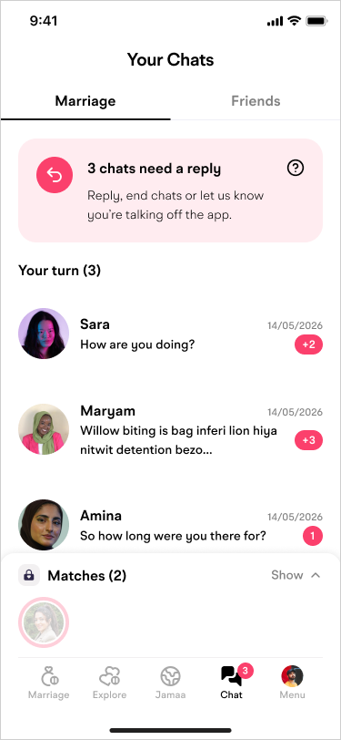
Route C
Repeated feedback:
Feels natural
Closer to chat app behaviour
Less anxiety because users can see chats
Potential concerns:
“Feels optional”
“Looks like a reminder/banner”
“Could be ignored”
“Not obvious enough”
“Too confusing”
Key takeaway:
Route C solves anxiety, but fails on mandatory behaviour signalling
Bringing the strongest elements together
Following testing, I shared the findings with stakeholders, who responded particularly well to Route A’s visual approach. The distinctive colour change made ghosted conversations stand out from regular chats, creating a stronger sense of urgency and making it clearer which conversations needed attention. Based on this feedback, we agreed to carry these strengths into the final design, combining Route A’s visual treatment with the stacked-card layout to keep users focused on resolving inactive conversations one at a time.
Keep ghosted chats distinct
Retained the stacked card layout to separate inactive conversations from regular chats.
Create focus and urgency
Carried Route A’s alert-style colour change into the final direction to highlight conversations that needed attention.
Make the next step clear
Kept the experience focused on one conversation at a time, avoiding an overwhelming list or uncertainty about who to message first.

Adding motion and feedback
I created a simple Lottie padlock animation to visually communicate when the experience was locked or unlocked. This gave users immediate feedback on their status and made the transition between states feel more intentional, rather than relying solely on copy to explain what was happening.
Refining the final experience
With the direction established, I focused on making the interaction clearer, more intuitive and less intrusive.
Add context, not clutter
Used an optional half-sheet to explain the feature without overwhelming the initial interaction.
Make states easier to recognise
Refined the ghosted profile cards with subtle visual effects to help communicate the state of each conversation.
Bring the interaction to life
Designed a Lottie padlock animation to communicate the locked and unlocked states, working closely with developers to refine the motion and card effects for the live experience.
Reduce anxiety through reassurance
Stakeholder feedback highlighted a concern that users might think their matches had disappeared. To reassure them, I introduced a blurred preview of their existing chats, paired with a familiar padlock icon to show that their conversations were still there, but temporarily locked until they took action.
Every detail was intended to make the experience easier to understand without adding unnecessary friction.
Launch & learnings
My biggest takeaway:
Encouraging a behaviour isn't just about making an action harder to avoid. It's about understanding why people respond the way they do, then designing an experience that makes the intended action clearer and easier to take.
Global launch
Feature launched globally across iOS and Android.
Improved user behaviour
Post-launch analysis showed a positive shift in user behaviour, with fewer users force-quitting the app and no customer support complaints about the feature.

Other features
Improving the Boost feature
I wanted to make Boost feel instantly recognisable while ensuring the experience worked naturally across different languages and didn't become intrusive.
Familiar visual language - Researched competitors and found the lightning bolt was a common pattern for communicating Boost.
Designed for every language - Tested different translations and identified issues with longer languages, including Arabic, causing copy to be cut off.
Considered placement - Explored different positions to find the right balance between visibility and avoiding disruption.
Added subtle animation - Used lightweight motion to draw attention to Boost without interrupting the user's experience.
Punchier messaging - Used a clearer benefit-led message to make the value of Boost immediately clear.
Adding Speed Play to Voice Notes
Added playback speed controls to make voice notes quicker and more flexible, giving users more control over how they listen.
Share and Download Media in Chat
Introduced easier ways to share and save media, making conversations more useful while keeping the experience simple.
Clearer Chat Badging
Refined chat badges to make important states and information easier to recognise at a glance, without adding visual clutter.