Youda
AI Meets Hospitality: Creating Tools for Modern People Teams
Industry
Hospitality
Tools used
Figma, Clickup

Product focus
Redesigning the Marketing Site to Champion AI
Enhancing visual consistency and refining user flows to clearly communicate AI as the core solution.
Crafting a Friendly & Trustworthy AI Chat Identity
Transforming an outdated chatbot into a modern, approachable, and brand-aligned assistant.
Launching a Cross-Platform MVP
Designing and developing the first mobile and web experience to onboard early users and validate the product.

Speaking to the client and Identifying the exact features and customer expectations for the brand
Requirements

Working closely with the customer experience team and engineers to determine product priority
Team check-ins

Prototyping proof of concept and vision pieces to push the product and think of future iterations past the MVP
Prototypes and iterations
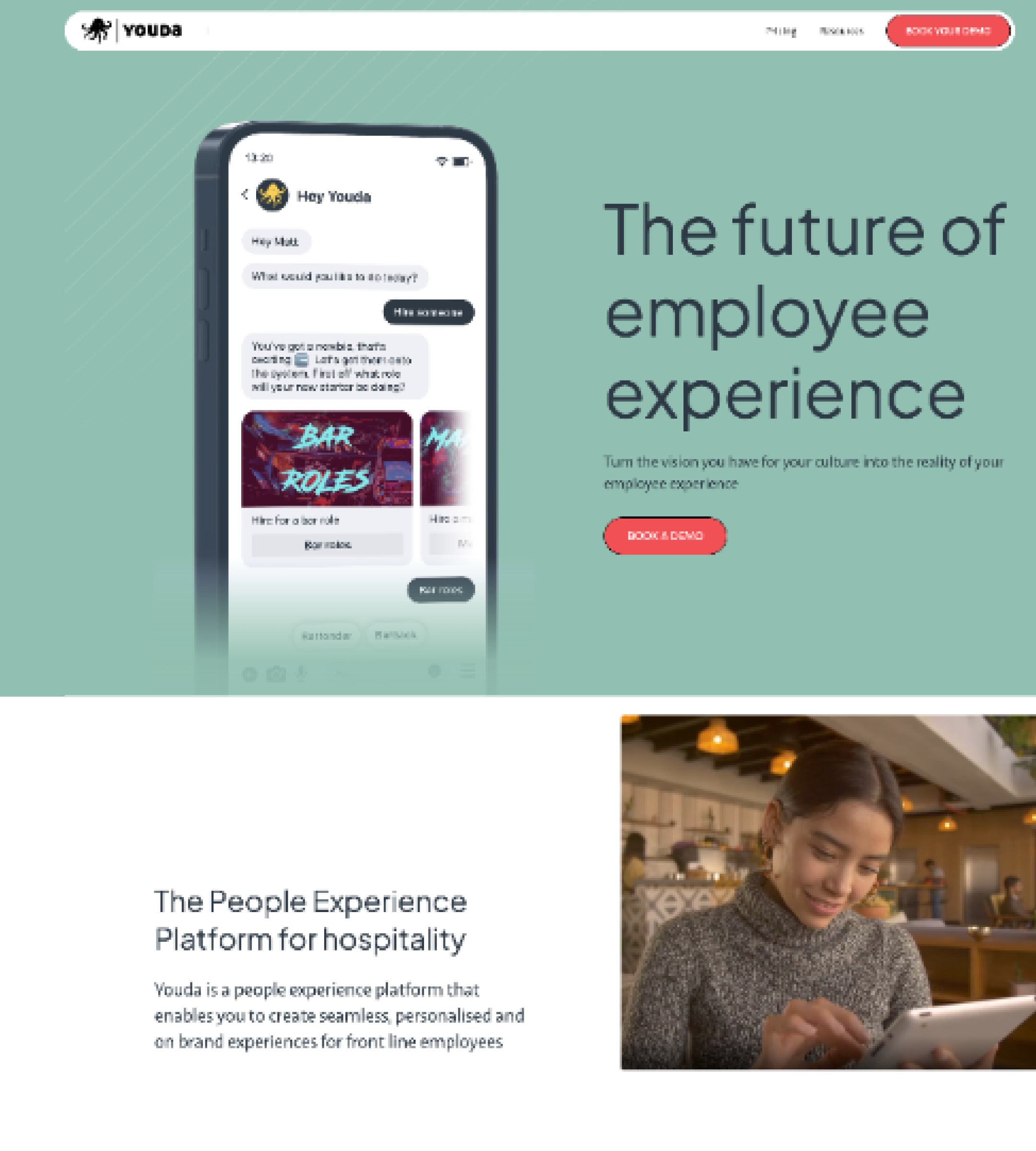
Startup Website Which Needed a Fresh Look
Before
While leading the redesign of the Youda marketing site, my focus was to better position the brand as a leading AI solution for people teams. I worked closely with the CEO to define a clearer narrative that spoke directly to customer pain points, showcasing how Youda’s digital assistants could support HR challenges in a smart, human-centric way.
Key Challenges Identified:
A weak and inconsistent visual identity
Lack of emphasis on the full AI-driven experience
Messaging didn’t reflect Youda’s innovative or groundbreaking potential

Modernising the Look to Match AI Innovation
After
After researching design trends across leading AI websites, I chose to introduce a darker, modern visual theme. This direction aligns with the aesthetic commonly associated with AI and future tech, while also allowing space for a new visual language—such as subtle hover states, glass-style overlays, and layered depth to evoke a futuristic, high-tech feel.
Key Visual Enhancements:
Introduced a bold, dark color theme
Upgraded typography for improved readability and tone
Designed a custom icon set
Selected imagery to reflect AI-driven workflows
Refined and simplified copy to align with user expectations

Customer-First Thinking to Drive Conversion
Time saving features
After speaking with the Customer Experience team, it became clear that time savings were the most compelling value driver for potential users. I focused on showcasing the app’s simplicity by presenting real-world example questions to demonstrate how quick and intuitive it is to use. We also highlighted that the basic version is free, removing friction and encouraging initial interest to drive conversion.

Humanising the AI Experience
People Teams
Striking the right balance between cutting-edge AI and human-centred design was essential. While the product leans into a futuristic aesthetic, I made sure the core message of ‘helping people teams’ remained front and centre. To ground the technology in reality, I incorporated team-focused imagery that reflected real workplace scenarios, adding warmth and relatability.
To highlight the AI’s capabilities, I also designed an infographic-style visual that highlighted a common people team query, demonstrating both power and ease of use in a simple, accessible format.
Animating the Experience
Collaborated closely with an animator to bring the website's visual style to life through a short animation. I ensured visual consistency by integrating existing design elements and maintaining alignment with the brand’s overall aesthetic, resulting in a seamless, cohesive experience across static and motion design.
Chatbot, Reinvented
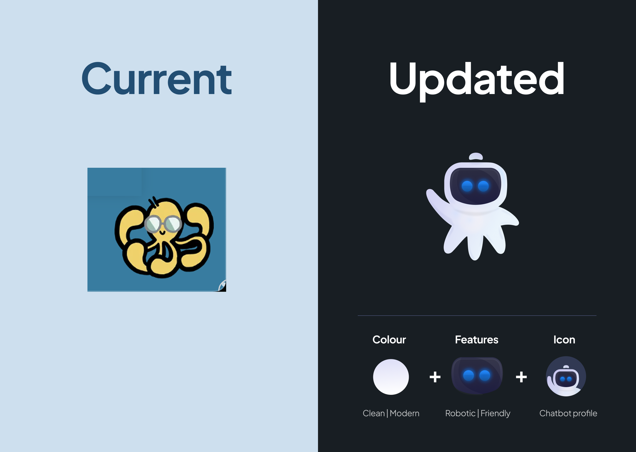
Updating the Chatbot Identity
Meet YoudaBot
Once the new marketing site was created, it became clear that legacy visual elements clashed with the updated aesthetic.
To align everything, I designed a modern chatbot character that reflected Youda’s new direction. The goal was to create a clean, friendly, and tech-forward identity, something that felt trustworthy and approachable while fitting seamlessly into the AI-focused visual language of the brand.

Creating a Tech Octopus
Concept to Creation
I explored a range of concepts for the new bot identity, with part of the brief focused on retaining subtle octopus elements while giving it a more futuristic feel.
The main design challenge was ensuring the bot remained recognisable and friendly, even at smaller sizes. Early versions with multiple tentacles felt overly complex when scaled down, so we refined the design to a simplified version with five tentacles. One was raised in a welcoming, helpful wave. This was a subtle gesture that reinforced the bot’s friendly nature. The final design worked well even as a tightly cropped profile image, striking a balance between character and clarity.
Reducing Steps and Simplifying Forms
Improving Engagement
Once the bot was redesigned, it became a central part of the updated sign-up flow.
The existing form was a basic, document-style layout with over 10 mandatory input fields—creating unnecessary cognitive load for users who just wanted to try the free version. The redesign focused on simplifying the experience, reducing friction, and speeding up the process.
Key Improvements:
Reduced required fields and introduced skippable questions to lower entry barriers
Emphasised time-saving benefits of the product to motivate sign-up
Added a progress bar for a touch of gamification and clearer user flow
Used friendly, bot-style language to make the process feel more welcoming and less corporate
Included time estimates to show how quick and easy it is to get started
The result was a lighter, more engaging onboarding experience aligned with the product’s promise of simplicity and efficiency.

Cross-Platform Product

Created the initial designs for a first iteration for the mobile app and webapp based on inital wave of product requirements
Short-term goal

Continue to iterate on product features once more users have been onboarded and we get even more feedback
Long-term goal

Increase the number of new clients who move their teams over to Youda and use it for all their HR needs
Success metrics
Bringing Workplace Culture Online
The brief was to design a modern, central hub where employees could easily connect with each other and stay updated on company news. I developed multiple interactive prototypes to test usability and gather feedback directly from the client.
To ensure ease of adoption, I leaned into familiarity bias by mirroring patterns from popular social apps, making the platform intuitive for first-time users. The main challenge was designing a system that supported multiple team spaces while also streamlining how users received and responded to company updates and events.
App - Newsfeed
Empowering People Teams to Manage Company News
Alongside the employee app, I designed a web-based version tailored specifically for People Teams to easily create, manage, and monitor internal communications.
I collaborated closely with one of the clients to identify key pain points, which helped shape the core features:
Clear active user analytics for post engagement
Simple and intuitive content calendar views
Preview functionality for reviewing posts before publishing
The goal was to streamline their workflow and give them more confidence and control over how updates were shared across the company.
WebApp - Newsfeed
Post Creation Made Simple
I designed a clean, intuitive user flow for creating new posts, with simplicity and ease-of-use at the core.
After speaking with the client, it was clear that previewing content was a top priority. To address this, I introduced a mobile phone-style preview panel, allowing People Teams to see exactly how their message would appear to employees.
This feature helped reduce hesitation and built confidence before publishing updates to the entire company.
WebApp - Newsfeed
Digestible News
Early discussions revealed that most People Teams preferred using laptops to post internal news updates. With that in mind, I designed a layout optimised for desktop use—maximising screen space and making content easier to manage.
Key features included:
A clean, at-a-glance dashboard of drafts, scheduled, and published posts
A streamlined feed for quick navigation and content scanning
Layout and UI choices focused on clarity and efficiency for busy teams
WebApp - Newsfeed
Evolving the Profile Page Into a Personal Hub
During iterative development, we revisited the profile page, which initially lacked depth, structure, and personalisation.
Ongoing conversations with the client uncovered new use cases for features like notes, reminders, and potential widget integrations.
With future scalability in mind, I explored how a more dynamic, modular layout could support both current needs and longer-term functionality, transforming the profile into a centralised space for personal productivity within the platform.
App - Employee Profile
Designing a Smarter Profile Experience
The goal was to refresh the profile page with a clearer hierarchy and modern structure. Introducing key elements like a profile avatar, quick-glance details, and cleaner layout.
This update laid the groundwork for the employee hub experience: a central space where team members can manage their personal info and access key company updates, seamlessly linking with the wider newsfeed ecosystem.
App - Employee Profile
Creating a more Centralised Profile Hub
The People Team needed a clear, efficient way to manage employee profiles. After speaking directly with the client, I identified the most critical information to show and prioritised a clean, at-a-glance layout.
The goal was to make profile data quick to scan and easy to manage, supporting day-to-day admin without overwhelming the user.
WebApp - Employee Profile
An Early Version of Messenger
An early MVP of the messenger feature was developed to test basic functionality and gather initial feedback.
As user needs evolved, it became clear that future iterations would need to support richer communication such as voice notes, GIFs, and file uploads, prompting us to rethink scalability and UX early on.
App - Messenger
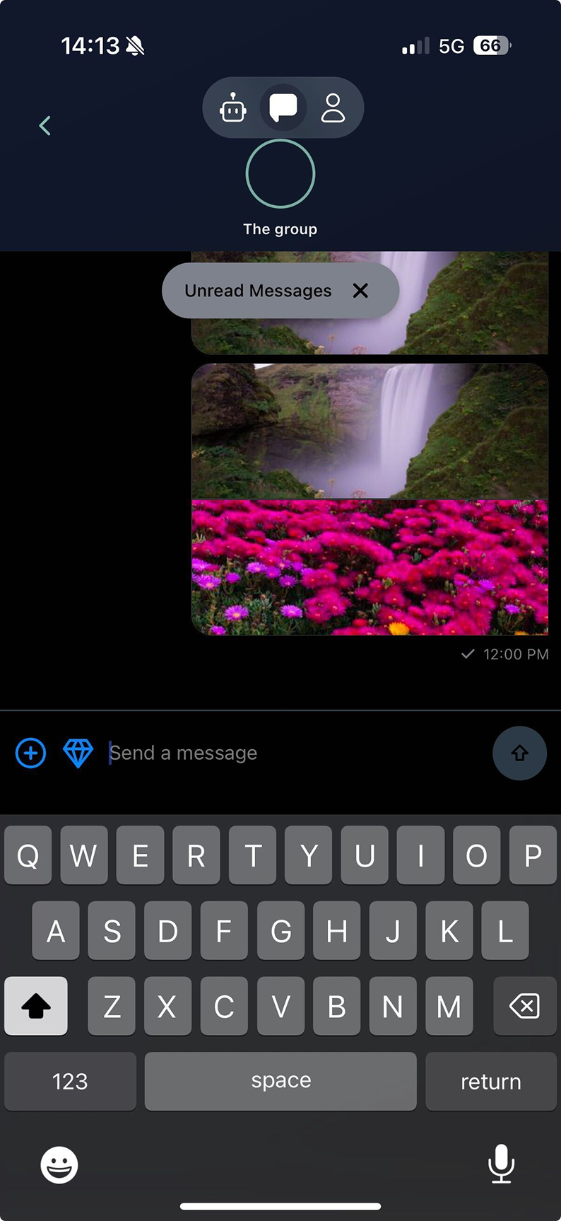
Enhanced Messaging Experience
To create a more polished and intuitive chat experience, I focused on modernising the UI and improving usability across key areas:
Increased message window height for better readability
Removed the main app navigation in chat view to reduce distractions
Introduced a slide-up GIF drawer for ease of use
Added support for voice notes
Updated icons for a more modern look
Redesigned file layout for easier access and sharing
Refreshed the colour palette to match the overall product direction
These updates brought a more focused, user-friendly experience that aligned with the app’s evolving functionality.
App - Messenger